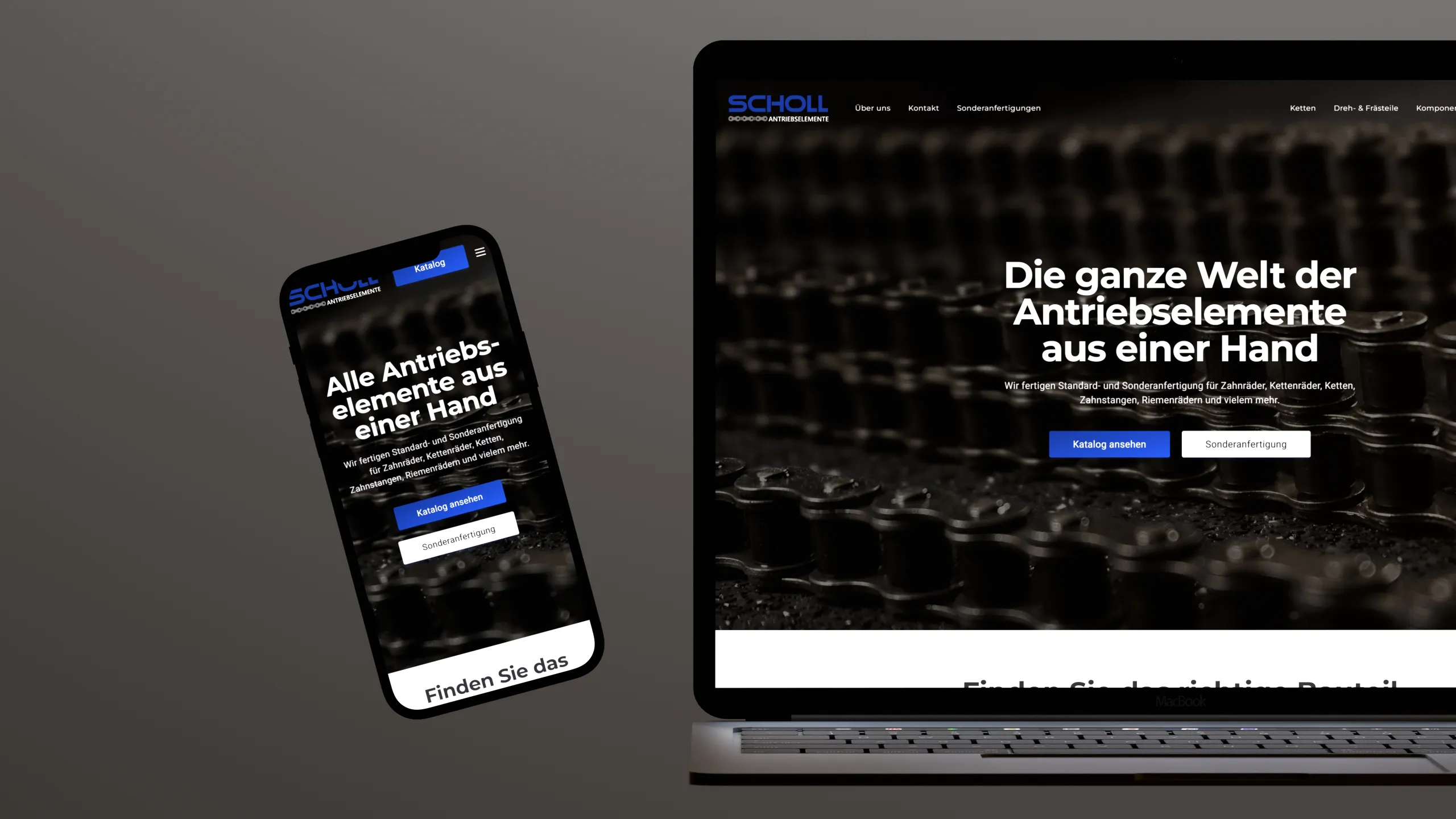
Website
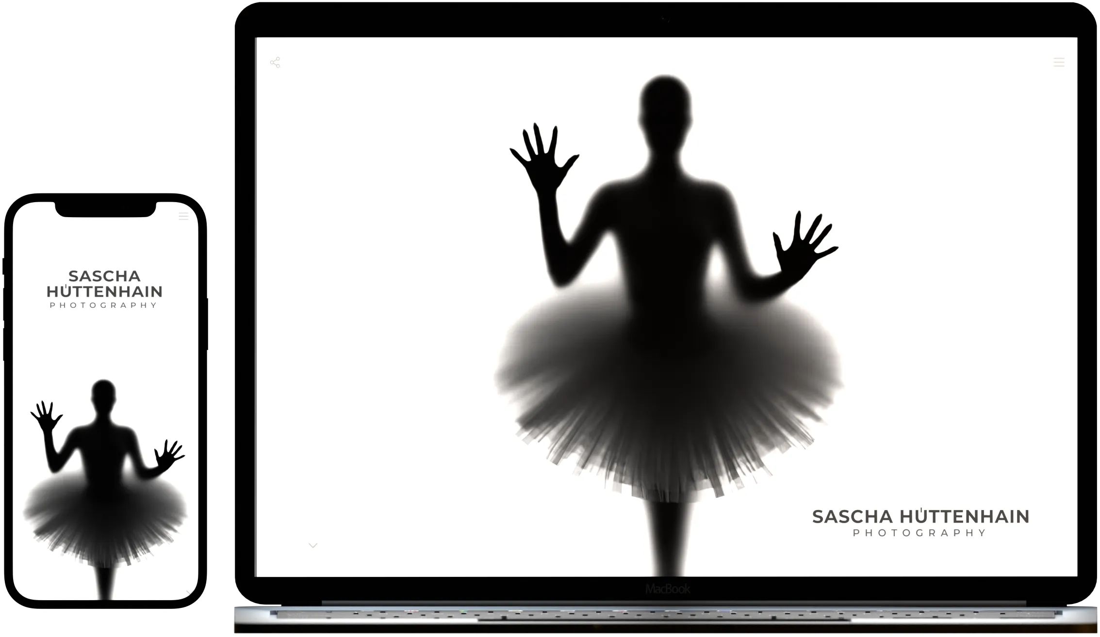
Sascha Hüttenhain Photography Website
This project showcases the minimalist website of Sascha Hüttenhain Photography, designed to optimally highlight the photographer's artworks. The website reflects the clear and precise aesthetic of his photography and allows visitors to explore the various categories of his portfolio.
Client
Sascha Hüttenhain Photography
Technologies
Astro, Svelte, Tailwind
Project Story
The Problem
Outdated technology and design
The old website of Sascha Hüttenhain no longer met modern design standards and was technologically outdated. Additionally, it did not reflect the minimalist aesthetic of his photography, which favors clear lines and simple shapes. The goal was to create a website that best showcases his works while embodying the same minimalist approach.


The solution involved developing a minimalist website built with modern web technologies such as Astro, TypeScript, Svelte, and Tailwind. The simple design was crafted to prominently showcase the artworks of Sascha Hüttenhain. A few, but precisely placed design elements support the focus on the artworks and the photographer himself. Utilizing Astro allows for fast loading times and efficient image resource management, while the design is perfectly adapted to various devices.
The Solution
Minimalism meets modern web technologies.
Challenges
Optimization of Image Display and Loading Times
A significant challenge was displaying the numerous high-resolution images intended for the website without negatively impacting loading times. This was addressed by integrating 'astro-imagetools', which stores images in various resolutions and automatically delivers the appropriate image based on display size and screen resolution. As a result, loading times were optimized without compromising image quality.
Project Showcase
Minimalist and clean design
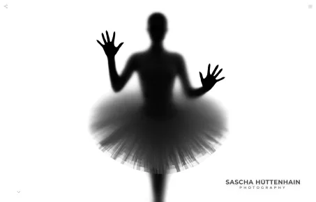
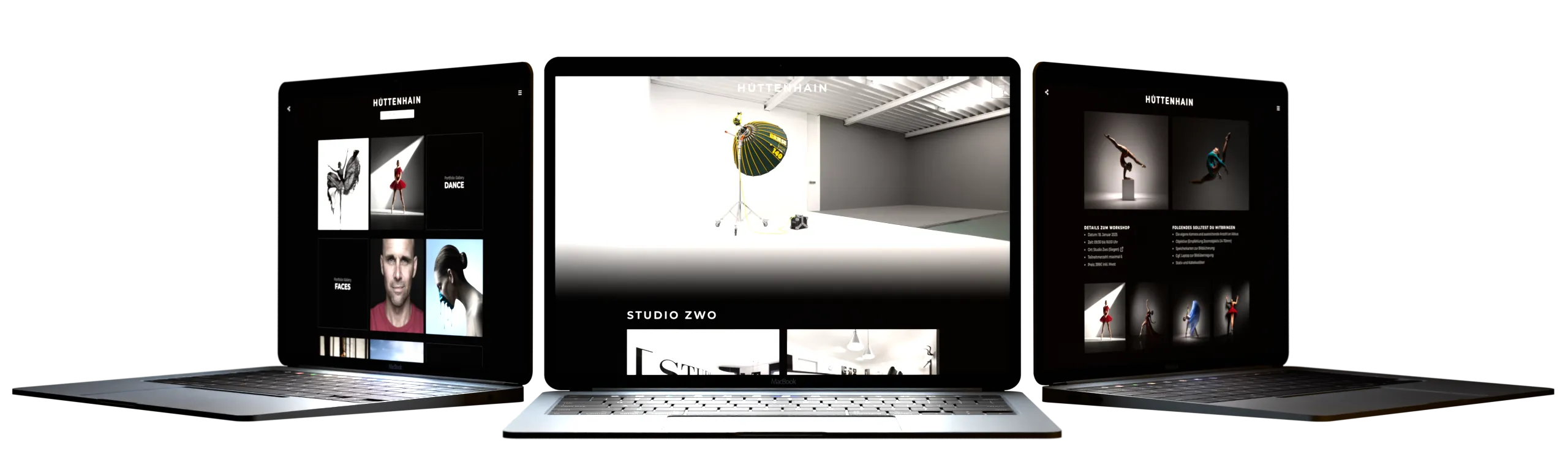
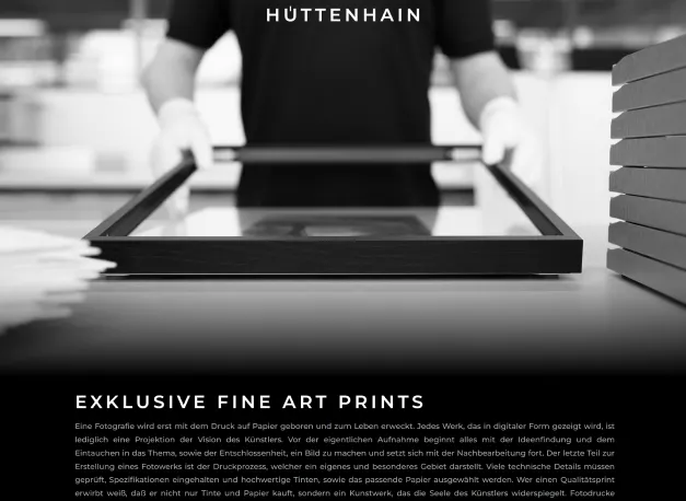
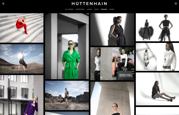
The website was designed with a minimalist aesthetic that reflects the clean lines and understated beauty of Sascha Hüttenhain's photography. By reducing elements to the essentials, the art is placed at the forefront, creating a calm and modern user experience that allows viewers to fully focus on the images.


Optimization for Mobile Devices
The website has been optimized for various devices. By adjusting font sizes, spacing, and layouts according to screen size, an excellent user experience is ensured on smartphones, tablets, and desktops. Users can easily browse through the portfolio, regardless of their screen size.
High-Quality Portfolio Presentation
The large portfolio of Sascha Hüttenhain is clearly organized on the website and presented in various categories. Visitors can navigate through the portfolio and view the works in impressive detail. Thanks to image optimization through the Astro extension, loading times are improved without compromising image quality.
Developing Showcase
Primary Frontend Technologies

Astro
Astro is a modern, open-source web framework designed for building fast, content-rich websites with minimal JavaScript.

Typescript
TypeScript is a superset of JavaScript that adds static typing to the language, helping to catch errors during development.

Svelte
Svelte is a modern JavaScript framework for building user interfaces that compiles components into highly efficient imperative code.

Tailwind
Tailwind CSS is a utility-first CSS framework designed for rapidly building custom user interfaces using pre-defined utility classes directly in HTML.

Shadcn
Shadcn is a collection of reusable UI components that can be copied and pasted into applications, primarily utilizing Tailwind CSS.
Astro-Imagetools
Astro ImageTools is a set of tools designed for optimizing and generating responsive images specifically for the Astro JS framework.
Conclusion
Sascha Hüttenhain's new website effectively showcases his works while reflecting the minimalist aesthetic of his photography. The site not only enhances the presentation of his art but also strengthens his online presence, providing an engaging user experience for potential clients and interested visitors.